Choosing Paint Colors for Your Tucson Home

Welcome to the Color Selection of the AA Brite 24/7 web page. Here you will find recent information on how to select colors for interior painting of your home or business. As you are aware color selection can range from following simple rules to being complex. One can even spend four years studying it at a college to get a degree. Obviously this web page will not be the four year version of color selection, but it will illustrate the basics as well as provide alternate paths to aquire great colors.

The photo above is of a Dunn Edwards fan deck which has been opened up and fanned out. Typically there would only be one or a few pages sticking out at any given time. There are over 1,000 colors shown in this particular fan deck. The photo below is a section on understanding color, using a page from this fan deck as an example.
Understanding Coloring – Per Page
The image below shows a fairly popular page out of the fan deck. I’ve numbered the colors from 1 to 7 to aid in explaining how these colors were formulated. Color #1 Tea Biscuit is made by taking raw uncolored paint called “base” and adding some tint to it. The person at the store mixing the paint will look up this color in the computer and add a certain number of ounces of colored tint to this base to get this color. Color #2 is made with the same color tint, but a little more of it is put into the raw paint. Colors 3 through 7 are made by adding more and more of the same color tint. Color #7 is the closest to the actual color of the tint being put into the raw paint.

So for conversational purposes, paint in color #1 was made by adding a few drops of tint to the raw paint. Color #7 used the same color tint but took a whole lot of it. In other words do you like your chocolate milk almost white, medium or do you take it as syrup with a drop of milk added? It’s the same with paint, and it goes from light color to progressively darker on each page of the fan deck.
Why does staying on the same page matter?
Great question, and there is a good answer. If you are a genius with color or “color stupid” (no offense meant) you can’t go wrong with painting your house with colors from this method, even if you use a different page from the fan deck, so long as all colors are chosen on the same page. They all go together because in a way they are all the same color. Any combination of colors from one through seven will coordinate. For example color #1 could be used on the ceiling, color #3 on the walls, and an accent wall could be #6. This method of matching paint colors is easy and hassle free. Plus you needn’t be anxious about what others might say regarding colors being compatible or not, as they are coordinated through the use of one tint.
What colors should I pick?
Now we are getting into the more difficult questions, but there are still guideposts. In Tucson tans and beiges are popular as they are soft and neutral. Which tan or beige? Interiors with high ceilings and lots of light can handle the darker shades while smaller and darker homes or offices need lighter colored paint. When I do the bid for you I’ll be happy to recommend conservative colors and show you where accent walls can be. If you’re looking for a high end color scheme that coordinates with furniture and uses different colors throughout the house then please read the interior decorator section. They are much more affordable than you might imagine ($100 – $150).
Popular Paint Store Brochures
If you want to pick colors that will not be on the same page of a typical fan deck and you’re not comfortable going it alone, then a safe, inexpensive and popular option is a paint store brochure which has pallets of colors picked by professional decorators. Just find a color pallet you like and rest assured the various colors on the pallet go together even though they are on different pages in the standard fan deck.

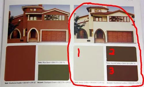
The section circled in the photo is from a Dunn Edwards brochure called “Spanish Mediterranean”. This brochure is popular and has good colors in it for Tucson. If you like the look of one of the twelve homes in the brochure then you have your three colors. Yes, this is an exterior brochure but I’ve circled a popular choice for interiors as an example of how it works.

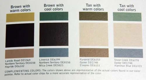
Pick one of the four sections and you have your three colors.
Don’t trust your computer monitor
You probably know this, but don’t trust any colors you see on your computer monitor. Every monitor looks different. The above colors might look great on one monitor and terrible on the next. The right way is to look at the brochure in person and then get it sampled. The photos were included to aid your understanding of how the process works, not to be technically accurate representations of the paint colors.
Accent Walls
Accent walls are typically darker in color. The safe way to do it is to paint, for example, a lighter color such as #2 on the walls and then use a darker color off of the same page in the fan deck like #6 or #7 for the accent. It’s a certainty they will look great together if done this way. If you choose to pick an accent color from a different page of the fan deck then the most popular colors are reds and dark reds. They are elegant and really pop, and a shade of red is what my wife and the decorator decided on together for our home. A nicely decorated home with a red accent wall looks great.
More Painting Tips


